Data Analysis using Asp.net MVC example
Analytics has been an important component for all type of business applications, so, as an asp.net developer you may have a question, like can we build analytics using asp.net! the answer is, yes! Asp.net has been evolved drastically, especially if we look at asp.net core framework, using latest features of asp.net core we can build anything that any modern web application demands, there are many plug-in and libraries for developing analytics in asp.net mvc application.
There are many in-built capabilities in asp.net mvc framework for developing analytics with data visualization, and then there are plenty of third-party component like dundas chart etc, which allow us to create excellent data visualization capabilities.
Data visualization in asp.net framework
Here are some examples from our real-time asp.net product development experience, which will help you to understand what type of simple analytics can help business owner to make decision, and you as business consultant should consider enhance as product features.
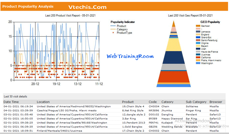
Product Popularity Analysis

This analytics is the combination of raw data and data visualization that will give a quick understanding of which products are more popular and potential buyers are clicking often, the data may help product owner to bring more variation of same product or thinking of putting more competitive price structure, so that sales volume can increase.
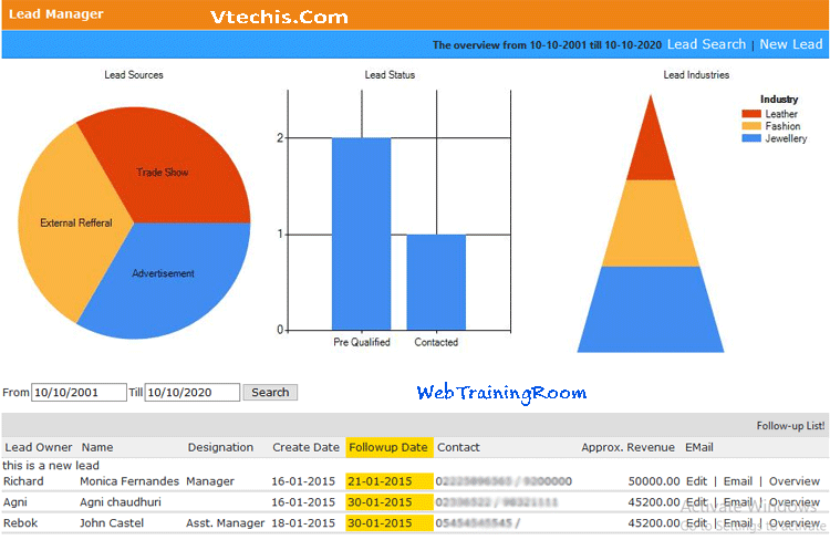
Lead Analysis

Generating quality lead is always tough, and there are various stages before any lead finally get converted to sales, the above analytics will tell business owner which are different lead source are more fruitful, which are the industry are generating more successful business etc.
Now if you notice in above two examples, one common thing is dataset, first we need to prepare the dataset with all required columns, make sure you keep all important columns first, which can be visible at first appearance, other column values can be displayed when user click on detail view or expand the report.
Here are two most efficient ways you can create data source.
- Create data source using ado.net dataset or datatable object.
- Creating data source from sql view in linq query or in ado.net object.
We can create chart using chart component in asp.net, there are various methods like AddSeries, AddLegend, Write etc which allow you to customise your chart, you also can select the right chartType depending on how you want the chart!
public ActionResult chart_productGeoPopularity()
{
var results = from p in _AdminService.GetVisitor(200)
group p by p.Region
into g
select new
{
rowKey = g.Key,
TotalCount = g.ToList().Count
};
string[] xArray = results.Select(s => s.rowKey).ToArray();
int[] yVisitCount = results.Select(p => p.TotalCount).ToArray();
        var grafico = new Chart(width: 310, height: 330);
        grafico.AddTitle("Last 200 Visit Geo Report " + @DateTime.Now.ToShortDateString())
        .AddSeries(
        name: "Geo",
        axisLabel: "Region",
        chartType: "Pyramid",
        xValue: xArray,
        yValues: yVisitCount)
        .AddLegend("GEO Popularity", "Region")
            .Write();
        return null;
    }
You can add multiple series in any chart, apart from one x-axis, all series can be added in y-axis, finally the Write method will create the image using the specified data.
string[] xArray = results.Select(s => s.rowKey.VisitDateTime.ToString("dd-MM")).ToArray();
long[] yProduct = results.Select(p => p.rowKey.ProductId).Cast<long>().ToArray();
long[] yCategory = results.Select(p => p.rowKey.CategoryId).Cast<long>().ToArray();
long[] yProductType = results.Select(p => p.rowKey.SubCategoryId).Cast<long>().ToArray();
var grafico = new Chart(width: 580, height: 330)
.AddTitle("Last 200 Product Visit Report - " + @DateTime.Now.ToShortDateString())
.AddSeries(
chartType: "Spline",
name: "Product",
axisLabel: "Product",
xValue: xArray,
yValues: yProduct)
.AddSeries(
            chartType: "Spline",
        name: "Category",
        axisLabel: "Category",
        xValue: xArray,
        yValues: yCategory)
.AddLegend("Popularity Indicator", "Yellow")
        .Write();
The above piece of code was written in .net framework 4.7.2 version, with new version and in .net core you probably find lot more additional features and functionality of chart component, and in nuget there are many additional chart component available, which will allow you to create different type of data visualization.
The new chart component will allow you to bind data source directly with chart instance in your razor page, like example below.
var data = db.Query("SELECT Name, Price FROM Product");
var myChart = new Chart(width: 600, height: 400)
        .AddTitle("Product Sales")
        .DataBindTable(dataSource: data, xField: "Name")
        .Write();
There are also some paid and highly customizable charting component for asp.net mvc application like Canvasjs, Dundas chart, Telerik etc.


