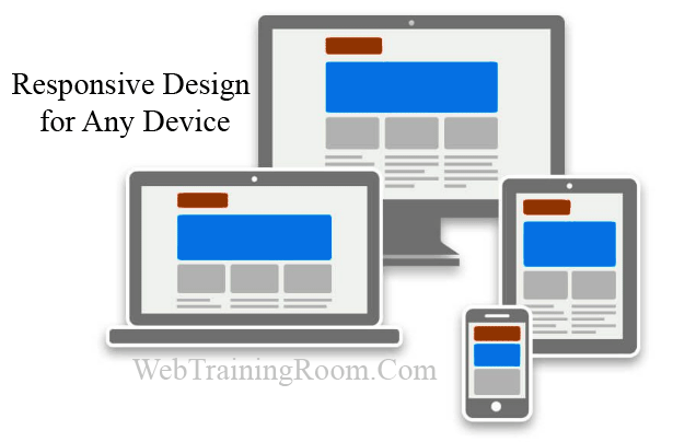
Responsive web page designing tutorial
Do you want to design more effective web page ? then this responsive web designing tutorial for you.
In this tutorial you will learn how to design a responsive website step by step.
What is responsive web page designing?These days it is very difficult to find someone who doesn’t have a mobile device, or multiple, connected to the Internet and the trends of mobile Internet usage will surpass that of laptop or desktop Internet usage within the year, because people keep browsing while traveling, having lunch and even before going to sleep.
How to make website responsive
So, keeping "device compatibility" in mind an obvious question comes in mind how to create a website that will be compatible with different type of mobiles and tablets apart from desktop / laptop .
Responsive website is something that easily can be browsed in different device , different re resolution and different browser, it opens up smoothly, it can help you to gain good user experiences thus improve business.
So now you have understood why making responsive website is important !
- You should know HTML and HTML5
- Basic CSS but knowledge of some css-framework like bootstrap bulma would be added advantage
- Basic JavaScript, Some JQuery knowledge would be helpful
Now here I share step by step implementation guide for responsive website designing, that help you to make website responsive!
Viewport meta tag
Viewport meta tag with name “Viewport” , look at code below, so whenever you create a new webpage make sure you have added the following tag in every page
<!DOCTYPE html>
<html xmlns="http://www.w3.org/1999/xhtml">
<head>
<title> </title>
<meta name="viewport" content="width=device-width, initial-scale=1.0" />
<meta http-equiv="X-UA-Compatible" content="IE=edge,chrome=1">
<link href="Content/etg_style.css" rel="stylesheet" />
</head>
<body>
</body>
</html>
Responsive Layout Container
When building a flexible responsive website / webpage, or making existing site responsive, the first thing to look at is the layout.
Create a container that will automatically shrink and expand based on device-screen width, this would be the main container, so all content on page will come inside this container
<body>
<div class="wrapper-container">
</div>
</body>
As you can see in above code for container div tag we have set a class class="wrapper-container"
Now we create the wrapper-container class in our Css file
.wrapper-container
{
    width:96%;
    margin:0 auto;
}
We want the container to take 96% of the screen and should stay in middle, so in both side we have some space
Content for Mouse versus Touch
When designing web content for mobile devices, you need to think what would be the challenges when people scroll your content on mobile screen with finger instead of desktop with mouse.
On desktop computers, the user normally has a mouse to navigate content and select items. On a mobile device / smart phone / tablet, the user mostly is using fingers while browsing the screen. What may seem easy to select with a mouse on desktop screen, may be hard to select with a finger on a tiny spot on a mobile screen.
So as a web designer you must consider the “touch screen” instead of using a mouse, make content appear accordingly.
Responsive Image
When adding any image in your web page make sure you add width tag with a percent value, so ideally you should have a container for image or a group of images
<img src="foldername/imgname.png" alt="responsive webpage image" title="responsive website image" style="width:100%;">
/* Tablet Landscape */
@media screen and (max-width: 1060px) {
    #primary { width:67%; }
    #secondary { width:30%; margin-left:3%;}
}
/* Tabled Portrait */
@media screen and (max-width: 768px) {
    #primary { width:100%; }
    #secondary { width:100%; margin:0; border:none; }
}
Make asynchronous call
Make the page async is possible, if there are multiple user control or partial views which is fetching data from database, try to make each one of them asynchronous, that will create good rendering experience for end user.
You also can call different view for different device like mobile, desktop
Don't use Table tag, only Div, Span
Some designer friend said that “table tag is the enemy of responsive web design” , many stop using that tag any more, you should too, table tag is not good for rendering also.
So use div or span or p tag , which has elasticity and good for rendering
Avoid in-line CSS or JavaScript
In-line CSS or JavaScript has nothing to do with responsive design directly , but keeping css class details and javascript code in external file will help to reduce the page size, thus improve the reusability of class and methods, also helps rendering faster, creating better user experience
You can use any CSS class library like Bootstrap, Bootstrap CSS library provide all ready to use CSS class that you need for any responsive webpage designing, it provide a CSS class that divide any web page into 12 columns concept, and there are class for any set of columns like “col-md-4” means four column, s o you can adjust your page look and feel by using page columns and rows as per your design, it follows all responsive layout best practices, you can check how to use bootstrap css


